
How to Build a High-Converting Landing Page That Actually Sells: Proven Secrets Revealed!
- FuelX Digital Team

- Jun 10, 2025
- 3 min read
Discover the ultimate guide on how to build a high-converting landing page that actually sells. Learn expert-backed steps, real case studies, and avoid costly mistakes to boost your conversion rates.

Introduction to High-Converting Landing Pages
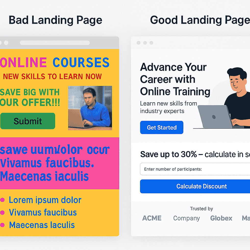
In the competitive world of digital marketing, having a website isn't enough. You need landing pages that convert visitors into leads or customers—not just attract them. A landing page is your silent salesperson. But what makes one page soar with conversions while another fizzles?
In this guide, you'll learn how to build a high-converting landing page that actually sells, backed by real-life case studies and expert secrets.
Key Principles of a High-Converting Landing Page
Simplicity and Clarity
Visitors must grasp your offer in 5 seconds or less. Clear, uncluttered design works best.
Value Proposition Above the Fold
Your top content should explain exactly what you're offering and why it's valuable—before scrolling.
Trust Elements and Social Proof
Including testimonials, security badges, and brand logos builds instant credibility.
Responsive and Mobile Optimization
With 60%+ of traffic from mobile, your page must load fast and display perfectly on all devices.
Step-by-Step Guide to Building a High-Converting Landing Page
Step 1 – Define Your Goal
Ask: What do I want visitors to do? Buy a product? Subscribe? Your design depends on this clear goal.
Step 2 – Know Your Target Audience
Create customer personas—age, interests, pain points—to shape your message and visuals.
Step 3 – Craft a Compelling Headline
The headline is king. Make it benefit-driven. Example:"Get 50% More Leads in 30 Days—Guaranteed!"
Step 4 – Create Persuasive Subheadlines
Subheadlines support your headline by elaborating the promise or adding urgency.
Step 5 – Design an Eye-Catching and Functional Layout
Good design directs the eye to your CTA. Use:
Whitespace to reduce overwhelm
Buttons that contrast the background
Simple, scrollable content.
Step 6 – Write Benefit-Focused Copy
Explain how your offer solves the visitor’s problem. Example:"Never waste time manually sending emails again."
Step 7 – Add Social Proof and Trust Signals
Use:
Customer testimonials
Client logos
Security seals ("SSL secured")
Step 8 – Implement a Strong Call to Action (CTA)
Effective CTA examples:
"Get My Free eBook Now"
"Start 14-Day Free Trial"Use action words and create urgency.
Step 9 – Optimize Forms for Conversions
Forms should ask for the minimum necessary info (e.g., name and email only). Complex forms deter users.
Step 10 – Test and Optimize Continuously
Regular A/B testing reveals what headlines, images, or CTAs convert best. Keep improving.
Case Study: Real Example of a High-Converting Landing Page
Background:
An online course provider's landing page was underperforming—only a 1.5% conversion rate.
Optimization Steps:
Rewrote headline: From "Online Courses for Professionals" to "Advance Your Career with Expert-Led Courses—Enroll Today!"
Added video testimonials
Simplified the form (reduced 7 fields to 3)
Results:
Conversion rate soared to 4.8%, a 220% improvement.
Common Mistakes to Avoid
Overloading with Information: Keep messages crisp.
Poor Mobile Experience: Test on real mobile devices.
Weak CTAs: Use urgent, actionable words.
Pro Tips for Sustained Landing Page Success
Use heatmaps to track where users click or scroll.
Personalize content for returning visitors (dynamic landing pages).
Regularly update testimonials and trust badges.
FAQs About Building High-Converting Landing Pages
1. What’s the ideal length for a landing page?
Depends on the offer. Short for simple actions, long for high-priced products.
2. How many CTAs should I include?
One main CTA, repeated 2-3 times.
3. Should I remove the website navigation bar?
Yes—removing distractions boosts focus and conversions.
4. What colors work best for CTA buttons?
Bright, contrasting colors like orange, red, or green.
5. How important are videos on landing pages?
Very—pages with videos can increase conversions by 80%.
6. How do I know if my landing page is effective?
Monitor bounce rate, conversion rate, and session time in Google Analytics.
Conclusion
A well-built landing page is the bridge between curiosity and action. By following these proven steps, your landing page can not only attract visitors—but convert them into loyal customers. Remember: clarity, simplicity, and trust are the pillars of success.

Comments